
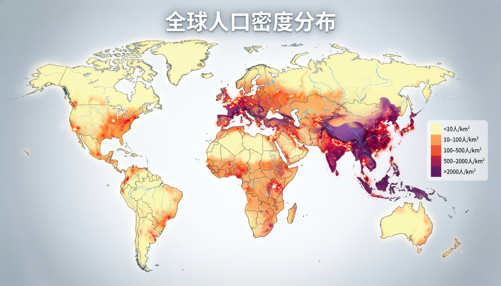
You look at a colorful map showing population density or climate zones and suddenly understand patterns that numbers alone cannot show. That is the power of a thematic map. These specialized maps go beyond showing roads and borders to highlight specific information in a visual way. You wonder if thematic map techniques still matter in our data-heavy world or if interactive dashboards have made them less relevant. This review explores the thematic map in detail so you can see why it remains a valuable way to communicate complex information clearly and effectively.
What Makes a Thematic Map Different
You compare a standard road map to a thematic map and notice the big difference right away. Regular maps focus on location and navigation. A thematic map focuses on one specific theme or topic. It uses colors, symbols, or patterns to show how something like income levels, election results, or disease spread varies across an area. The goal is to reveal patterns, trends, and relationships that help you understand the data better. Good thematic map design turns raw statistics into something you can see and remember. This visual approach helps students, researchers, business leaders, and policymakers make better decisions based on clear geographic insights.
Common Types of Thematic Maps
You explore different styles and see several popular types of thematic map. Choropleth maps use colors to show data values for areas like countries or states. Dot density maps place dots to represent quantity, making clusters easy to spot. Isoline maps, such as weather maps with temperature lines, connect points of equal value. Proportional symbol maps use circles or icons of different sizes to show data at specific locations. Each type serves a different purpose, and choosing the right one helps your audience understand the message quickly. The variety available means you can find a thematic map style that fits almost any dataset you want to share.
Benefits of Using Thematic Maps
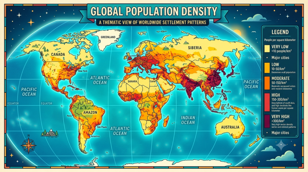
You use a thematic map and immediately see why they remain popular. They simplify complex data and make patterns obvious at a glance. A well-designed thematic map can communicate more information in one image than several paragraphs of text. They engage viewers emotionally and help non-experts understand topics like environmental issues or public health trends. Businesses use them to analyze market potential, while governments rely on them for planning resources. The visual nature also makes thematic map presentations more memorable and persuasive than tables full of numbers alone.
How to Create Effective Thematic Maps
You start building your own thematic map and follow a few key principles for success. Choose appropriate data and a clear message before selecting colors or symbols. Use a color scheme that makes sense for your data — sequential colors for increasing values or diverging colors for values above and below a midpoint. Keep the design simple and avoid too many categories that confuse viewers. Label important features clearly and include a legend that explains what the colors or symbols mean. Test your thematic map with people who know nothing about the topic to make sure the message comes across. These steps help you create maps that inform rather than overwhelm.
Real-World Applications You See Every Day
You encounter thematic map examples more often than you realize. Weather apps show temperature or precipitation patterns using color-coded maps. Election coverage uses red and blue thematic map displays to show voting results by region. Public health organizations map disease outbreaks to direct resources where they are needed most. Environmental groups use thematic map visualizations to highlight deforestation or climate change impacts. Businesses analyze customer locations with heat maps to decide where to open new stores. These practical uses show how thematic map techniques turn abstract data into actionable insights across many fields.
The Role of Technology in Modern Thematic Maps
You see how digital tools have transformed thematic map creation. Software like ArcGIS, QGIS, and even simple online platforms let anyone produce professional-looking maps without years of training. Interactive thematic map versions let users zoom, filter, and explore data dynamically. Cloud-based tools make collaboration easier than ever. While technology makes maps easier to create, it also increases the risk of misleading visualizations if designers choose poor color schemes or misleading scales. Understanding basic cartography principles remains important even with powerful software available.
Potential Pitfalls to Avoid
You learn from common mistakes and see several ways thematic map projects can go wrong. Using too many colors or inappropriate symbols can confuse viewers instead of clarifying data. Cherry-picking data or using misleading scales can distort reality and damage credibility. Ignoring cultural or perceptual differences in color meaning can create unintended messages. Overly complex designs that try to show too many variables at once often fail to communicate anything effectively. Taking time to review your thematic map with fresh eyes and test it with others helps catch these issues before they reach your audience.
The Future of Thematic Maps
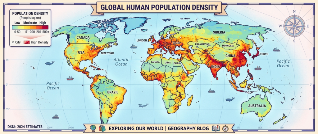
You look ahead and see exciting developments in thematic map technology. Real-time data feeds create live maps that update automatically. Augmented reality could let people see thematic information overlaid on the physical world. Artificial intelligence might suggest optimal color schemes or detect misleading visualizations automatically. Despite these advances, the core purpose of a thematic map stays the same — making complex spatial data understandable and actionable. The tools will change, but the need for clear geographic communication will remain strong.
Final Verdict on Thematic Maps
The thematic map remains one of the most effective ways to communicate spatial information in our data-saturated world. You gain clarity, engagement, and insight when data comes to life through thoughtful visual design. While technology continues evolving, the fundamental principles of good thematic map creation stay constant: know your audience, choose appropriate methods, keep designs clear, and always prioritize accuracy. Whether you create simple classroom maps or sophisticated interactive dashboards, the thematic map helps turn numbers into understanding. Next time you need to explain how something varies across space, consider using a thematic map. The right visualization can make your message not only clearer but also more memorable and persuasive. In a world full of information, the ability to show patterns visually gives you a powerful advantage.
[…] options, and convenient technology that makes daily life easier and more enjoyable. The approach works best when you focus on changes that match your lifestyle and priorities instead of copying […]
[…] exposure to matter. Constantine Yankoglu carved his own quiet legacy, and that choice deserves recognition in its own right. Readers finish articles like this feeling a bit more curious about the unsung […]